
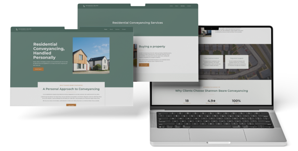
Shannon Beare Conveyancing Limited needed a professional identity and website that reflected Shannon’s personal approach to residential conveyancing.
The website needed to build confidence quickly, explain her services clearly and show prospective clients that they would deal directly with an experienced conveyancing professional.
Killed Pixel Studio created the complete brand identity, website structure, written content and wider digital foundations.
The project combined calm visual design with clear service information, transparent consultant model wording and an enquiry journey designed to build trust before the first conversation.
Shannon Beare has worked in conveyancing since 2006.
She began her career on reception, progressed into legal support roles and studied through the CILEX route while working full time.
She later managed her own caseload, qualified and became an equity partner before choosing to work independently under the consultant model.
Her approach is grounded in clear communication, practical explanations and careful attention to detail.
Shannon does not work with extremely high caseloads, allowing her to focus more closely on each client and remain a consistent point of contact throughout their property transaction.
Legal services are provided through the firm under which Shannon practises, while her own professional presence remains central to the client relationship.
Shannon wanted a professional website that would appeal to people buying, selling or remortgaging property without feeling like a traditional high street legal website.
It needed to feel established and credible while remaining calm, warm and approachable.
The website also needed to explain the consultant model clearly and present the relationship with the relevant firm accurately.
Shannon’s brand identity needed to work consistently across the website, social profiles, supporting documents and future marketing.
The finished presence needed to communicate her practical experience, direct communication and personal service from the first interaction.
The central challenge was creating a distinctive independent presence while presenting the wider firm relationship clearly.
The website needed to place Shannon and her personal reputation at the centre of the experience without creating confusion about how regulated legal services are provided.
Shannon’s career journey and CILEX route also formed an important part of her professional story. This needed to be communicated clearly and concisely while remaining relevant to the needs of prospective clients.
The completed website also needed to feel personal and established through its content, visual identity and carefully selected property imagery.
The positioning focused on residential conveyancing handled personally.
Rather than presenting Shannon as part of a large team, the website highlights direct communication, practical experience and attentive service throughout the property transaction.
The visual identity uses muted reed green, warm off white, charcoal and a restrained copper accent.
Clean typography, property led imagery, generous spacing and simple layouts help the website feel established, calm and reassuring.
The content structure answers the questions prospective clients are likely to have before making contact.
Shannon’s experience and career progression are explained clearly, her services are easy to understand and dedicated guidance pages provide useful information without overwhelming the reader.
✓ New logo and visual identity
✓ Primary and reverse logo variations
✓ Brand colour and typography guidelines
✓ Responsive consultant conveyancer website
✓ Home page
✓ About page
✓ Services page
✓ What to Expect page
✓ What Is Conveyancing page
✓ Contact page
✓ Privacy policy
✓ Cookie policy
✓ Terms and conditions
✓ Residential conveyancing service cards
✓ Buying and selling content
✓ Auction transaction content
✓ Remortgage content
✓ Transfer of equity content
✓ Leasehold content
✓ Building Safety Act exclusion wording
✓ Holiday chalet conveyancing content
✓ Consultant model transparency wording
✓ Company and professional footer information
✓ Contact enquiry form
✓ Clickable telephone and email links
✓ Cookie consent controls
✓ Desktop, tablet and mobile optimisation
✓ Search foundations
✓ Page titles and meta descriptions
✓ Search friendly URLs
✓ Image alternative text
✓ Google Search Console verification
✓ Social sharing image
✓ Website favicon
✓ Google Business Profile setup
✓ LinkedIn and Facebook brand assets
✓ Brand guidelines
✓ Handover documentation
✓ Practical walkthrough guidance
The project began with detailed information from Shannon covering her business details, career history, service scope, preferred domain, client audience and visual preferences.
This information was used to define the website structure, positioning and complete brand direction.
The logo, visual identity and core website pages were created as one connected system so that Shannon could review the full client experience.
The content was then refined around Shannon’s feedback, including the presentation of her experience, career progression and CILEX route.
Responsive design, search foundations, technical setup and handover materials were completed once the brand and content direction had been approved.
Shannon received a private preview of the complete website so she could review the design, content and client journey across desktop, tablet and mobile.
Her feedback was used to refine the written content and ensure that the final presentation reflected her experience and preferred way of working.
The website was structured to support the relevant firm review process, with the consultant relationship and required professional wording presented clearly.
The completed website, brand assets and handover materials were then delivered to Shannon alongside the wider search and business profile setup.
The completed website gives Shannon one clear and professional place to present her experience, services and personal approach.
Prospective clients can understand what she offers, how their matter will be handled and how the consultant relationship works before making an enquiry.
The brand now feels consistent across the website, social assets and supporting documents.
The service journey is easier to navigate, Shannon’s practical experience is more visible and each page reinforces the calm communication and personal attention that are central to her approach.
The result gives Shannon a distinctive and credible presence designed to build trust before the first conversation.
This project brought Shannon’s personal reputation, practical experience and residential conveyancing services into one clear digital presence.
The identity and website were designed to feel professional and established while remaining approachable and easy to understand.
Before a prospective client speaks to Shannon, they can see who will handle their matter, understand the services available and feel reassured by the clarity of the process.
The result supports trust before the first conversation without losing the personal character that makes Shannon’s approach distinctive.
Share this case study